Col Fondo Natural Wine Magazine
Student Project — UC Berkeley, Graphic Design
The Brief
A self-directed editorial design project to concept, design, and produce a print magazine from scratch. The subject matter was self-chosen — Col Fondo, a fictional natural wine magazine exploring the culture, people, and places surrounding biodynamic and natural wine production. The challenge was to develop a complete editorial identity — logo, typography system, cover design, and interior layouts — that felt considered and publishable rather than academic
My Role
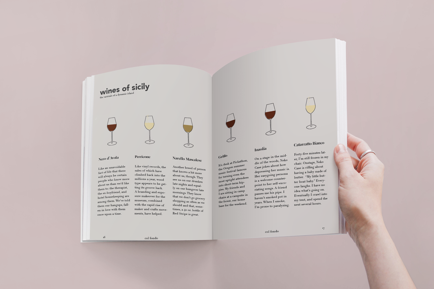
Concept, art direction, logo design, typography, layout design, and original illustration — all created independently. Photography is stock within the layouts.
The Process
Natural wine as a subject has a specific cultural world — unhurried, earthy, connected to place and season. The design needed to reflect that sensibility without feeling rustic or retro. The editorial voice I was going for was sophisticated and literary.
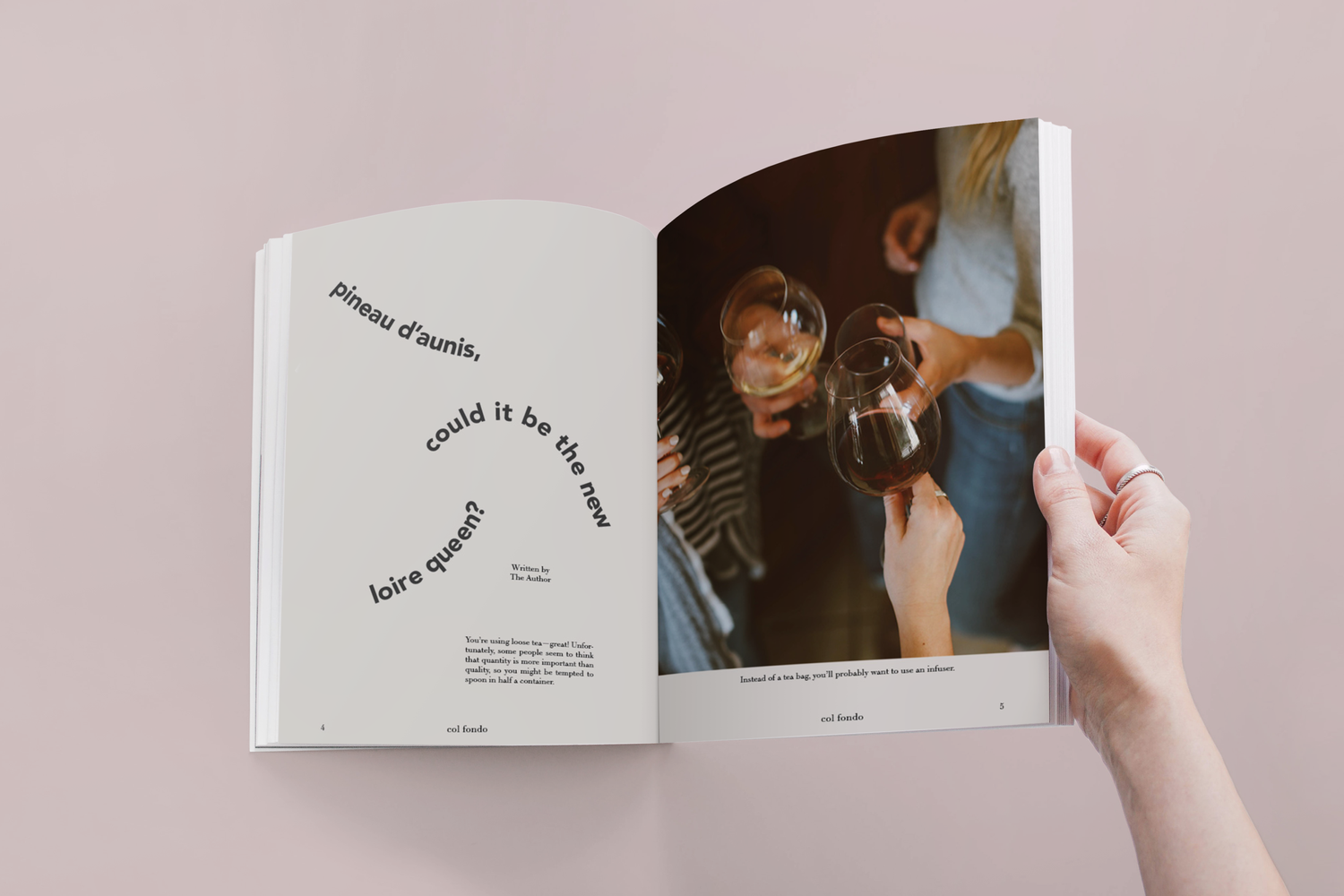
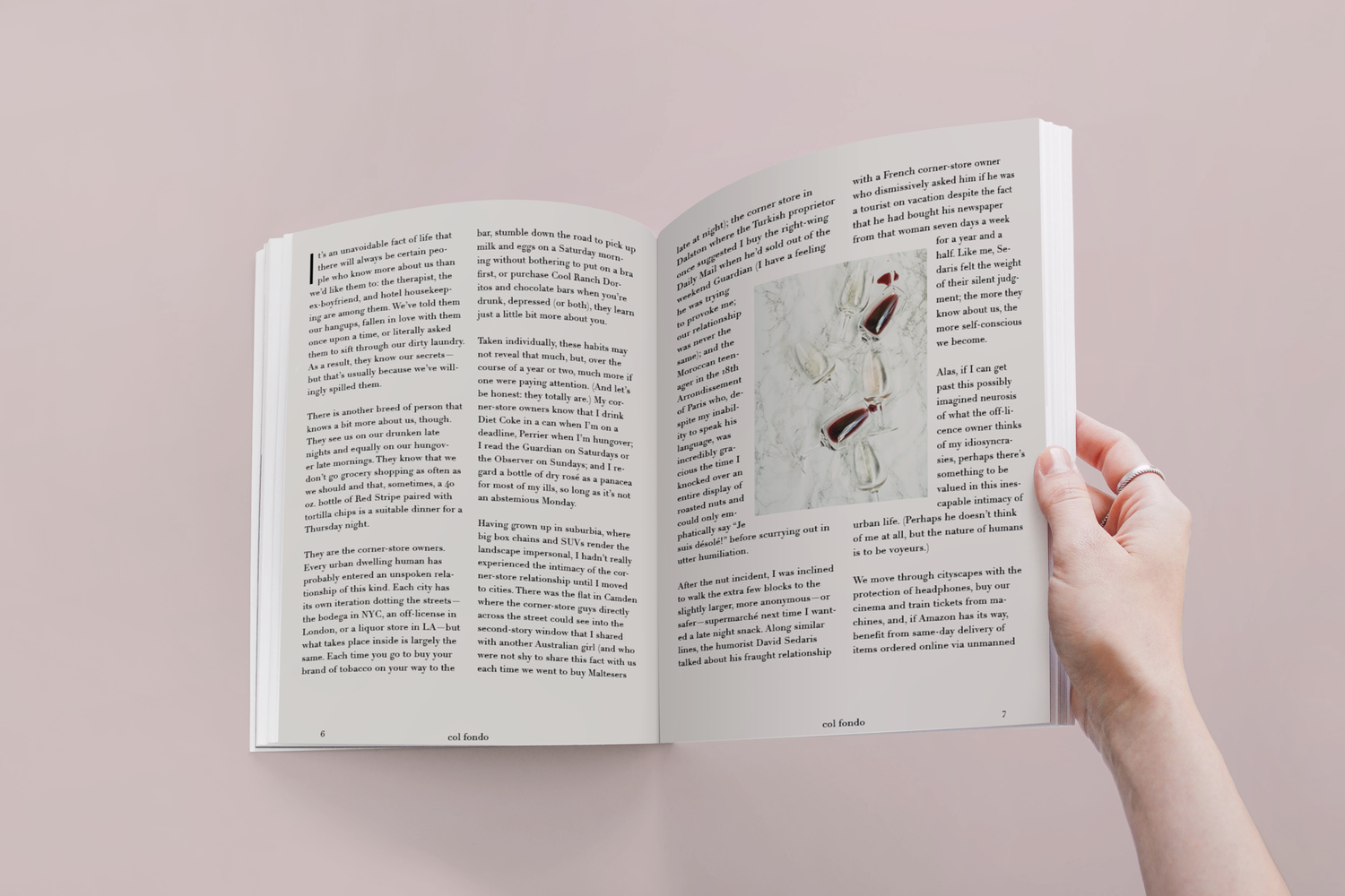
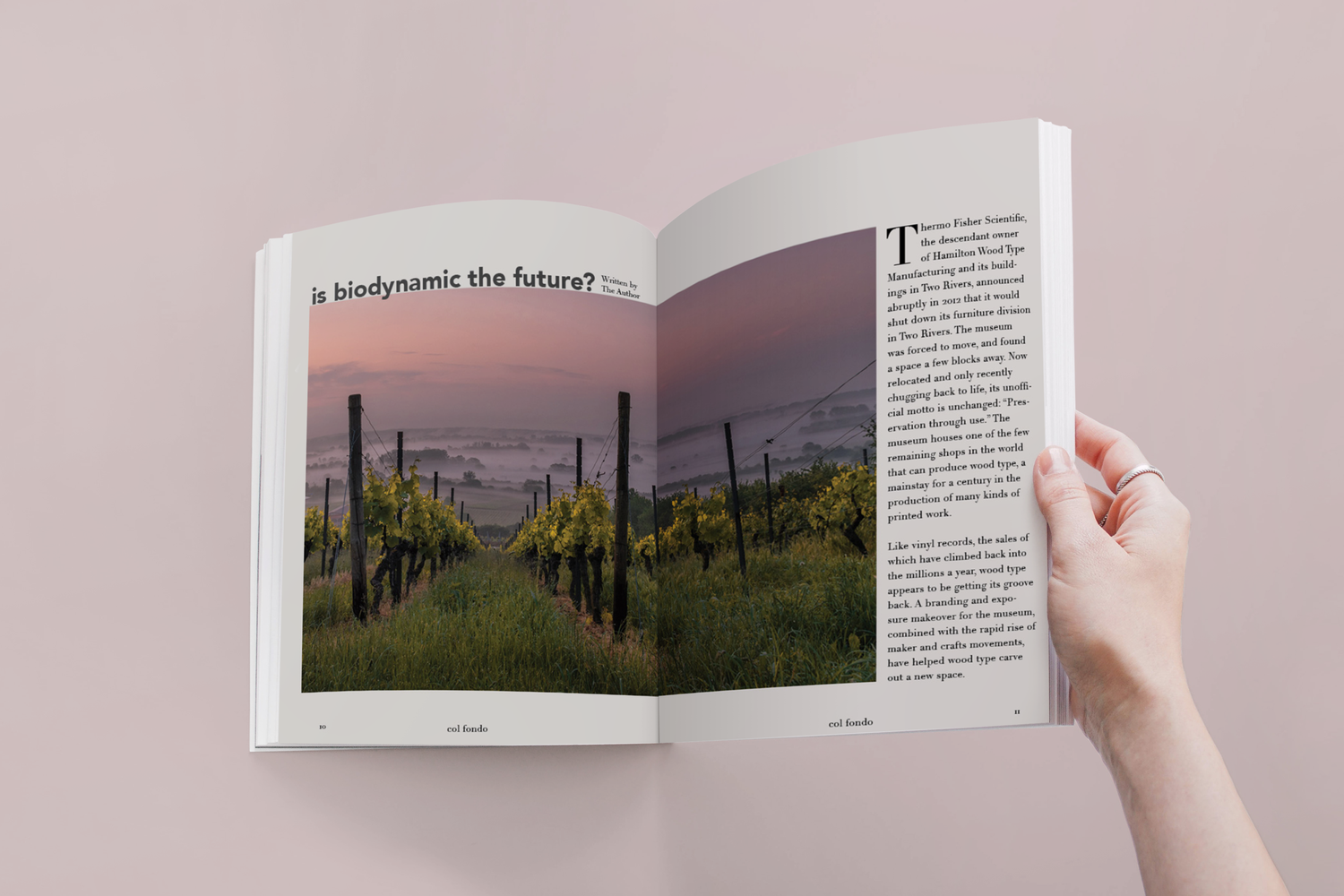
The typography system was central to every decision. The curved, hand-lettered quality of the headline type on the feature spreads — "pineau d'aunis, could it be the new loire queen?" — gives the magazine a warmth and personality that straight editorial type couldn't achieve. Pairing that with tight, classical body text and structured grid layouts created the tension between loose and considered that felt true to natural wine's own contradictions.
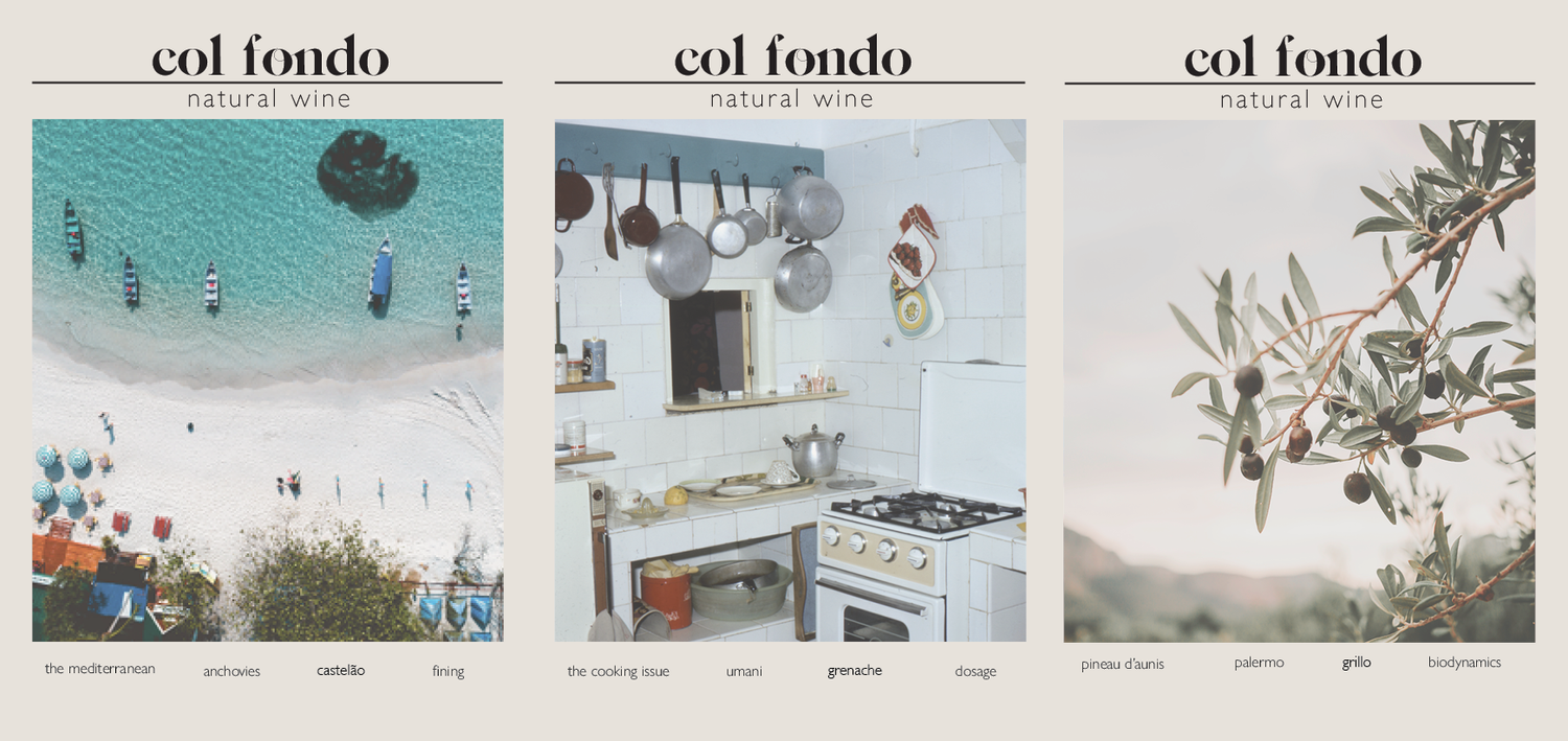
The cover system uses a consistent masthead treatment with a strong photographic crop below — simple enough to work across multiple issues while leaving room for each cover image to set its own mood. Three covers shown here demonstrate how the system holds together as a family while each feeling distinct.
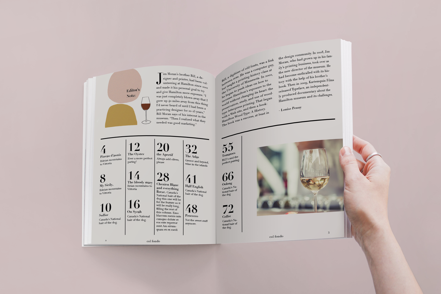
Interior layouts balance long-form editorial with structured information — the table of contents uses a grid system that organizes dense information clearly without feeling corporate. The illustrated editor's note spread brings in a handmade quality that softens the more formal layouts elsewhere.